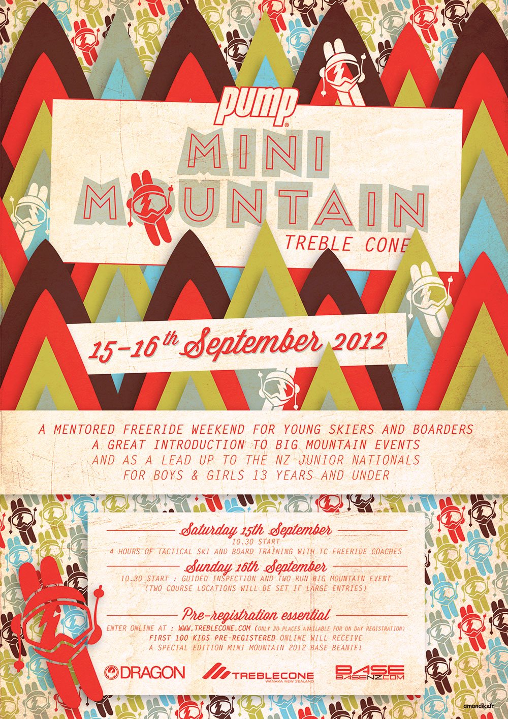
Many people ask me how do I design new posters. I’ll reveal in this article how I created the last poster for the Mini Mountain Comp at Treble Cone in New Zealand.
This is the final result:

The inspiration
The brief given by the marketing department of Treble Cone was to create something fun and colorful for this event aimed at kids under 13. Through the styles showed to me was this cushion:

Yes, it is “just” a cushion but it is crazy how a little cushion can help sooo much ! As you can see, it definitively inspired the color skim.
The creation
Along with the poster, Treble Cone wished to design beanies to offer to every participants. They asked me to create a little logo that would be used on the beanie as long as on the poster. For that reason, I designed a little boy, stylish with huge goggles, seen from above.

I take a picture of the drawing and vectorize it in Adobe Illustrator by drawing around the lines.

Patterns are a new trend that we see more and more often in any kind of designs: print, textile, interior design… and I like pattern style. So I tried creating a pattern from those little skiers, mixing up colors inspired by the cushion:

This pattern remind me of chinese downhill seen in a humorous way. I though that be fun to add mountains around so that those little skiers would actually be skiing from the mountain.
Here I’ve been inspired by a picture of beautiful envelops I saw in the morning on the web:

From that I created those mountains:
I played with the organisation of colours and shapes, adding some drop shadow to create deepness between the mountains.
Font choices
For the curly and vintage style font, I used Wisdom Script.
For the main title I used Frontage Outline. As opposed but complementary to the previous font, this one is more squared and thin.

For the rest of the text, I used a common font called Letter Gothic Std.
Proofs before texturing
This is how the poster looked like once finished on Illustrator.

Proofs after texturing


And TA DAAMMM !
This poster has been displayed in Wanaka during the month of September 2012, and the comp has been a success. It has been a pleasure to coach some of those kids and impressed by their performance ! Well done boys and girls !