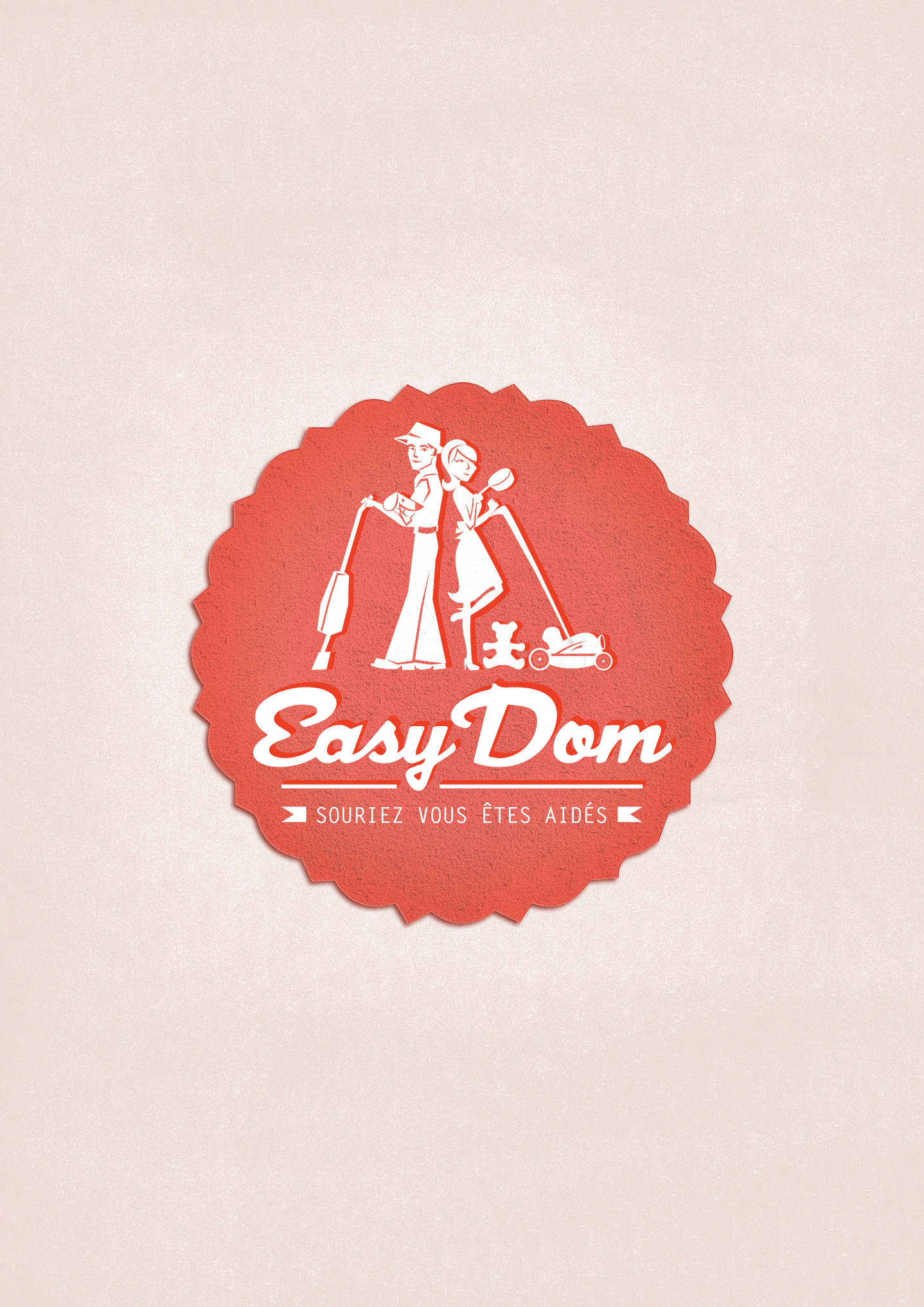
Here is the latest creation made: the logo of a home support company “Easy Dom” located in Grenoble, France.
This company was recently founded by two dynamic young ladies. They wanted a logo that reflects their activity, which is modern, young and dynamic. Their idea was a logo of a vintage style ” Charlie’s Angels”.
In order to respect their limited budget, I asked them to give me their logo ideas to achieve something that exactly meet their needs. Thus, the creation of the logo is faster and less expensive.
For colors, we would like something dynamic, young and modern.
We think of a man and a woman back to back looking in the same direction, each holding something representing one of our services in their hands.
Here is the final result, chosen by the customer. After that, I’ll explain how I created this logo.
The logo design process
-
Pencil drawing
-
Vectorization the design and inclusion in different forms of the logo according to
-
A version is selected and I made some little improvements
This includes small shadows and reflections and the suggestions of several choices of colors in tones demanded: pink / purple.

4. Adding textures to the final


C’est clair, que question dessin, tu ne tiens pas de ta maman, je suis beaucoup plus à l’aise avec des casseroles qu’avec des crayons !
J’aime beaucoup ce côté rétro, ça dénote bien des logos que l’on voit habituellement.
Bonjour Amandine,
J’ai vu ton lien sur le forum WEB qui ma permis de découvrit ton travail.
Très intéressant la manière dont tu démontre le travail que cela représente de réaliser un logo et au finale le résultat et magnifique.
Bon dimanche
Cédric
Merci beaucoup Cédric, ton commentaire fait très plaisir, d’autant plus que viens de jeter un oeil à ton site et je vois que cela vient d’un pro ! Tu as de supers articles sur ton site !
Bon dimanche à toi !
Amandine